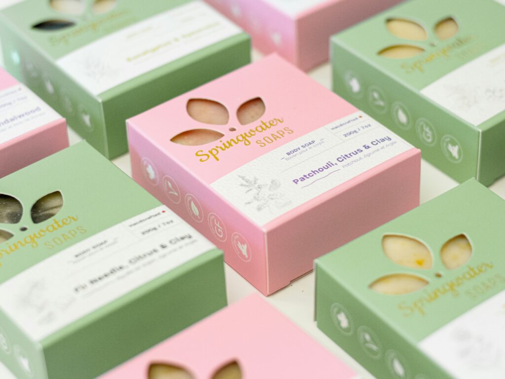
A product label may occupy only a small part of a package, but it carries a considerable amount of responsibility.
It identifies the brand, tells customers what the product is, communicates important information, and contributes to the product’s overall appearance. If the label is difficult to read or poorly organised, even a well-made product can struggle to present itself effectively.
Good product label design balances visual appeal with clarity, functionality, and the requirements of the product category.
Whether you are launching a beverage, food item, cosmetic, household product, or industrial product, the label deserves careful planning.
1. Make the Brand and Product Easy to Identify
Customers should be able to recognise the brand and understand the product without unnecessary effort.
The brand name and product name are often among the most important elements on a label. Their placement and size should reflect how customers are expected to identify the product.
For a product range, consistency matters. If every variant uses a completely different layout, customers may struggle to connect the products with the same brand.
A common design structure helps maintain recognition while allowing individual variants to stand apart.
2. Create a Clear Information Hierarchy
Not all label information has equal importance.
A useful hierarchy guides the customer’s attention from the brand and product name to the variant, key product details, and supporting information.
Typography, size, contrast, spacing, and placement all influence readability.
Avoid using too many fonts or making every line equally prominent. When everything competes for attention, nothing stands out.
Remember that a label viewed on a computer screen may look larger and clearer than the same label printed on a small bottle or container. Always evaluate the design at its actual size.
3. Choose Colours That Suit the Brand and Product
Colour can influence how a product is perceived, but there are no universal rules that guarantee a particular response.
Bright colours may suit an energetic consumer product. Restrained palettes may be appropriate for a minimalist skincare range. Strong contrast may help important information remain visible.
The choice should consider the audience, product category, brand personality, and competitive environment.
Research competing products before finalising the palette. You want the label to feel relevant to the category without simply copying what other brands are doing.
4. Use Typography Carefully
Typography affects both the appearance and usability of a label.
A distinctive typeface can contribute to brand recognition, but highly decorative fonts may become difficult to read at small sizes. Long product names, ingredient lists, and technical information require particular attention.
Establish a clear relationship between headings, product details, and supporting text.
Check contrast against the background and avoid placing small text over complicated photographs or patterns.
The label must remain legible under the lighting conditions and viewing distances likely to occur in real use.
5. Consider the Shape and Material of the Package
Label design should not be developed independently of the packaging structure.
A label intended for a cylindrical bottle behaves differently from one placed on a flat box. Curved surfaces, tapered containers, seams, and corners can affect how the artwork appears.
The label material must also suit the product’s environment. Moisture, refrigeration, handling, exposure to oils, and other conditions may influence adhesive and material selection.
Consult the packaging manufacturer or printer before finalising dimensions and specifications.
6. Include Required Product Information
Depending on the product and market, a label may need to display ingredients, quantity, manufacturer details, batch information, usage instructions, warnings, dates, declarations, or other mandatory information.
These requirements vary by category and jurisdiction.
For products sold in India, businesses should verify applicable requirements for their product type, including relevant food labelling, packaged commodity, cosmetic, or other sector-specific regulations where applicable.
Do not treat compliance as a last-minute addition. Required information can influence the available design space and overall layout.
Where necessary, consult a qualified regulatory professional before approving the final artwork.
7. Design a System for Multiple Variants
Businesses often launch additional flavours, sizes, fragrances, or product formulations over time.
Creating a consistent label system from the beginning can make future expansion easier.
Keep core elements such as the logo, typography, and layout consistent. Use controlled changes in colour, variant names, imagery, or other approved elements to distinguish products.
This approach can reduce redesign effort and make the full product range look cohesive.
8. Test the Final Label Before Printing
Digital artwork should be checked carefully before production.
Review spelling, dimensions, alignment, colour settings, image resolution, bleed, safe areas, and any barcode or variable-data requirements.
A physical proof helps reveal problems that may not be obvious on screen, including small text, colour differences, material issues, and placement errors.
For curved or unusually shaped containers, test the label on the actual packaging format whenever possible.
Correcting a problem before mass printing is usually easier than correcting thousands of finished labels.
Make Every Label Work Harder for Your Brand
A good label is not simply decorative. It helps customers identify, understand, and use a product while reinforcing the brand’s identity.
Mark Studio provides creative support across product label design, packaging design, and brand identity. We aim to connect the visual presentation of a product with practical considerations such as readability, consistency, and production.
Conclusion
The most effective product label designs combine a clear hierarchy, suitable typography, thoughtful colour choices, accurate information, and careful production planning. By paying attention to these details, businesses can create labels that look professional and work effectively in real-world conditions.