In a world overflowing with marketing content, the loudest messages aren’t always the ones that get remembered. Sometimes, it’s the quietest visual choices — like the font on your packaging or the letter spacing in your logo — that speak the loudest to your customer’s brain.
At Mark Studio, we call this the “silent influencer” of branding: typography. Often overlooked in mainstream advertising discussions, typography is one of the most subtle yet powerful tools in your creative arsenal.
🔠 Why Typography Deserves a Seat at the Strategy Table
Let’s break the myth: Typography isn’t just a design choice — it’s a strategic branding element.
A luxury real estate brochure using a playful handwritten font? Brand disaster.
A kids’ brand using sharp, all-caps serif type? Feels cold.
A Gujarati wedding jewellery ad using minimal Helvetica? Feels disconnected from cultural expectations.
Fonts tell stories before words do.
And in the realms of marketing, branding, and advertising, the tiniest shift in type can change the entire perception of your brand.
📉 Bad Type = Broken Trust
Typography carries subconscious meaning. The wrong typeface can make your brand look:
- Cheap instead of premium
- Boring instead of exciting
- Outdated instead of innovative
- Unclear instead of trustworthy
Inconsistent or poorly chosen typography can break the emotional bridge between brand and buyer — and in advertising, that emotional bridge is everything.
🧠 The Psychology Behind Fonts
Research in consumer psychology shows that:
- Sans-serif fonts (like Futura or Helvetica) signal modernity and clarity
- Serif fonts (like Times New Roman or Georgia) suggest tradition and authority
- Script fonts evoke elegance, intimacy, or creativity — but must be used sparingly
- Monospaced fonts bring in a tech-forward or utilitarian vibe
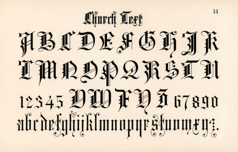
Different markets react differently too — for example, audiences in Surat often associate ornate fonts with celebration and prestige, especially in jewellery, real estate, and cultural events.
🎨 How Creative Agencies Should Use Typography Strategically
At Mark Studio, we approach type like we approach colour, layout, or narrative: with intention. Here’s how:
- We choose fonts based on audience psychology, not trend.
- We build brand guides that define when and how fonts should be used (print, digital, packaging, hoardings).
- We custom-create or modify typefaces when a brand’s tone calls for something totally ownable.
- We test readability + cultural resonance, especially for multilingual designs — a must in Indian markets.
🏆 Real Brands That Win With Fonts
Some iconic examples:
- Vogue’s elegant serif: screams luxury and timelessness
- Netflix’s custom font: strong, modern, digital
- Amul’s retro script: familiarity, nostalgia, and cultural rootedness
- Zomato’s bold sans-serif: confidence, clarity, everyday relevance
Final Thoughts: Branding That Feels Right Starts With Design That Reads Right
Typography may not scream like a tagline or dazzle like a logo animation, but it quietly controls how your audience feels about your brand — second by second, word by word.
And in the business of creative branding and marketing, what you don’t say visually matters as much as what you do.
At Mark Studio, we’re not just font-obsessed. We’re feeling-obsessed — making sure your brand typography works not just aesthetically, but emotionally, culturally, and commercially.
Let your brand speak — in a voice that looks as strong as it sounds.
Let’s build that together.


