In the world of technology, clarity is everything.
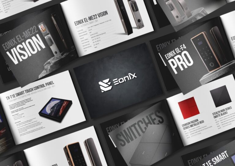
Brands in the smart home and electronics space deal with complex products—switches, locks, automation systems—and communicating their features effectively is crucial. This is where brochure design becomes a powerful tool.
At Mark Studio, we approach brochure design as a blend of information and aesthetics.
The layout is the backbone. A well-structured brochure guides the reader seamlessly from one section to another, ensuring that key information is easy to understand. Clear headings, balanced spacing, and logical flow are essential.
Typography plays a major role too. Clean, modern fonts enhance readability while reinforcing the brand’s tech-driven identity. Bold headings draw attention, while subtle body text ensures clarity without clutter.
Visual hierarchy is what makes the design effective.
By strategically placing images, icons, and content, we ensure that the most important information stands out. Product visuals are highlighted in a way that showcases both functionality and design.
Color palettes in tech branding often lean towards darker tones, metallic accents, or high-contrast combinations. These choices reflect innovation, precision, and modernity.
The goal is simple: create a brochure that not only informs but also builds trust and credibility.
Because in technology, design is not just about looking good—it’s about making information accessible and impactful.