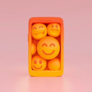
In a world where consumers are constantly bombarded with advertisements and marketing messages, standing out requires more than just a clever tagline or eye-catching visuals. To truly engage with your audience, brands must tap into something deeper—their emotions. This is where emotional branding comes in. Emotional branding focuses on creating a strong, emotional connection between a brand and its audience, using design elements to evoke feelings that inspire trust, loyalty, and even love.
For businesses, especially in competitive industries, building an emotional bond with consumers can be the difference between a one-time purchase and lifelong brand loyalty. In this blog, we’ll dive into what emotional branding is, how design plays a critical role in it, and how your brand can leverage this strategy to create stronger, more meaningful connections with your audience.
1. What is Emotional Branding?

Emotional branding is a marketing strategy that seeks to form a deep, emotional bond between a brand and its consumers. Rather than focusing solely on the functional benefits of a product or service, emotional branding aims to connect with the audience on a personal level by appealing to their emotions, values, and aspirations.
When done correctly, emotional branding can foster trust, loyalty, and a sense of belonging. Consumers don’t just buy a product; they buy into the brand’s story, message, and values, aligning themselves emotionally with what the brand represents.
Example:
Think of brands like Apple or Nike. Consumers don’t just purchase a phone or a pair of shoes—they buy into the idea of creativity, innovation, self-expression, and personal achievement. These brands have successfully cultivated a sense of community and emotional resonance through their branding strategies, creating not just customers but advocates.
2. The Role of Design in Emotional Branding

While words can communicate a message, design has the power to evoke emotions instantly. The visual elements of your brand—colors, typography, shapes, and imagery—play a critical role in shaping how consumers feel about your brand. When used strategically, these elements can influence how consumers perceive and connect with your brand on an emotional level.
a) Colors and Emotions
Color is one of the most powerful tools in emotional branding because of its ability to evoke specific feelings. Different colors trigger different emotional responses, so choosing the right color palette for your brand is crucial.
- Red often symbolizes excitement, passion, or urgency. It can be used to evoke feelings of energy and enthusiasm, making it a popular choice for brands in the entertainment and sports industries.
- Blue conveys trust, calmness, and reliability. This is why many financial institutions and tech companies, like PayPal and IBM, use blue in their branding.
- Yellow is associated with happiness, optimism, and warmth. Brands like IKEA and McDonald’s use yellow to create a welcoming and cheerful environment.
- Green often represents nature, health, and growth. It’s a common choice for brands in the wellness or eco-friendly sectors, like Whole Foods and Animal Planet.

b) Typography: The Voice of Your Brand
Typography can communicate the tone and personality of your brand. Bold, modern fonts suggest strength and innovation, while more traditional or script-like fonts can evoke feelings of elegance, luxury, or timelessness.
- Serif fonts (those with little lines or flourishes at the ends of letters) are often perceived as trustworthy and traditional, which is why many established institutions like law firms or universities use them.
- Sans-serif fonts, which are clean and modern, evoke feelings of simplicity, forward-thinking, and reliability. Brands like Google and Facebook use sans-serif fonts to reflect their modern and user-friendly etho

c) Shapes and Imagery: Tapping into the Subconscious
Shapes and imagery have a psychological impact on consumers, often working on a subconscious level. Rounded shapes like circles and ovals evoke feelings of harmony, protection, and unity, while sharp shapes like squares and triangles suggest stability, efficiency, and strength.
The imagery you use also communicates your brand’s story. Photos of real people, for example, can make your brand feel more relatable and authentic, helping to build trust. Abstract or minimalist imagery can suggest sophistication and innovation, appealing to a more design-savvy audience.
Example:
The logo of Target, for example, uses the circle—a symbol of unity and community. Combined with the brand’s bold red color, it creates an inviting, energetic image that makes customers feel a sense of belonging while shopping.

3. Examples of Emotional Branding in Action
Some of the most successful brands in the world have used emotional branding to create deep connections with their audience. Here are a few notable examples:
- Coca-Cola: Coca-Cola has long been associated with happiness, joy, and togetherness. Their marketing campaigns, like “Share a Coke,” encourage personal connection, while the brand’s iconic red and white logo triggers feelings of excitement and celebration.
- Dove: Dove has positioned itself as a brand that celebrates real beauty and self-confidence. Their “Real Beauty” campaign tapped into the emotions of millions by challenging beauty stereotypes and promoting self-love. The minimalist logo and gentle blue and white color scheme reinforce the brand’s values of purity and authenticity.
- Nike: Nike’s “Just Do It” slogan, combined with emotionally charged ads featuring athletes overcoming obstacles, taps into the universal emotions of determination, perseverance, and personal achievement. The brand’s clean, minimalist design lets the emotional messaging take center stage, inspiring millions to feel empowered.

4. How to Incorporate Emotional Branding into Your Design
Here are a few tips for incorporating emotional branding into your design strategy:
- Understand Your Audience’s Emotions: Start by identifying the emotions you want to evoke in your target audience. What feelings do you want to associate with your brand? Is it trust, excitement, or a sense of belonging? Understanding this will guide your design choices.
- Choose Colors with Purpose: Select a color palette that aligns with the emotional tone of your brand. Consider the psychological effects of colors and how they can help reinforce your message.
- Design for Authenticity: Today’s consumers value authenticity. Use imagery and design elements that reflect real-life experiences, diversity, and honesty. This can create a sense of trust and emotional connection with your audience.
- Use Emotional Storytelling: Don’t just rely on visuals—use your logo, packaging, and website design to tell a compelling story. Whether through imagery or subtle design cues, the story should connect with your audience emotionally.
- Consistency is Key: Ensure that your emotional branding is consistent across all touchpoints—your website, social media, advertisements, and packaging. This will create a cohesive brand experience that reinforces emotional connections.

Conclusion
In today’s market, emotional branding is not just a nice-to-have—it’s essential for building lasting relationships with your audience. By strategically using design elements like colors, typography, and imagery, brands can evoke emotions that foster loyalty, trust, and connection. For Mark Studio, helping clients build these emotional bonds through thoughtful design will ensure their brands resonate deeply with consumers, driving long-term success.
Incorporate emotional branding into your design approach, and you’ll find that your brand is not only seen but felt—creating relationships that go far beyond the transactional.


