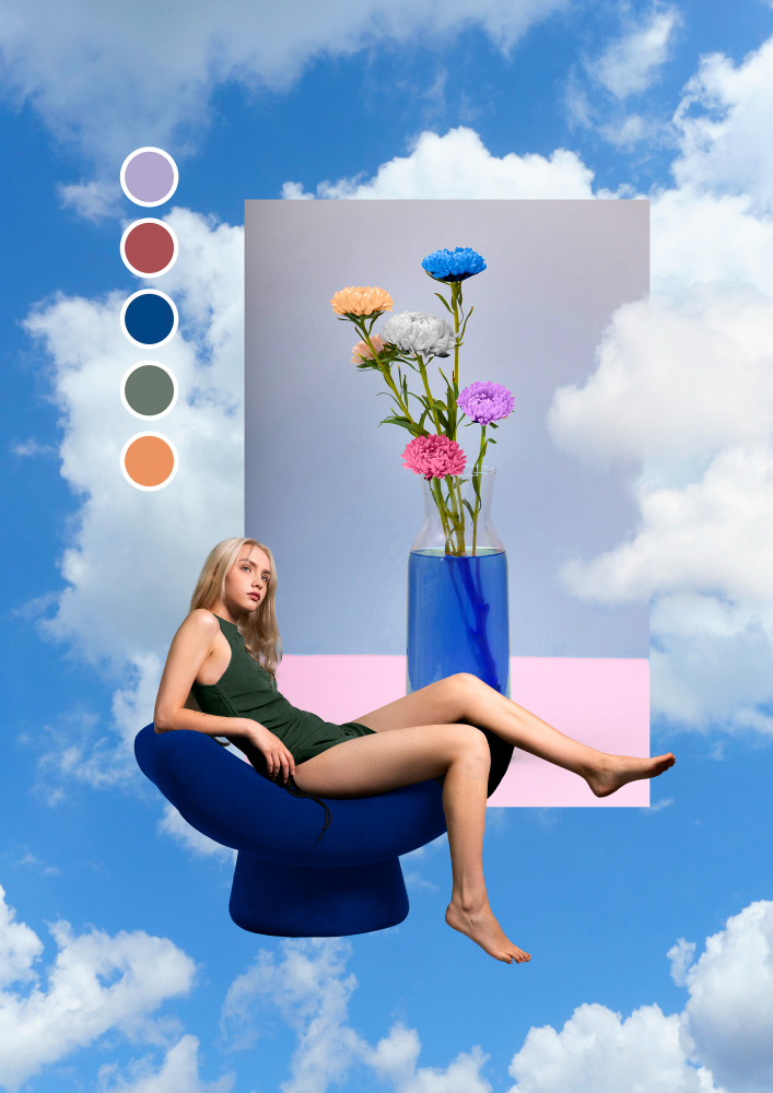
🎨 Beyond Red and Blue: Color Isn’t One-Meaning-Fits-All
In global branding conversations, colors often come with default associations:
🔵 Blue = Trust
🔴 Red = Excitement
🟢 Green = Nature
But if you’re working in a multicultural market like India, these associations aren’t always accurate. That’s where regional color psychology becomes a powerful — and underrated — tool in advertising, branding, marketing, and creative direction.
At Mark Studio, we’ve learned that what a color means in Delhi might not feel the same in Surat, Jaipur, or Kochi — and that hyper-local insights can make or break a campaign.

🧠 Why Regional Color Strategy Is Crucial
Consumers don’t just see color — they feel it. And that feeling is shaped by:
- Local traditions and festivals
- Cultural rituals and religion
- Climate and geography
- Historical references
- Popular cinema and politics
A luxury brand in Gujarat might need to lean into golds, deep pinks, and reds to feel aspirational. The same brand in Kerala might resonate better with whites, greens, and natural tones.

🎯 What Happens When You Get Color Wrong?
- Your brand feels out of place
- Campaigns don’t connect emotionally
- Your packaging gets ignored on the shelf
- You miss the chance to build cultural trust
Color isn’t just decoration — it’s strategy in disguise.
🌈 Examples of Regional Color Nuance in India

- Red:
- In North India = Celebration, marriage, wealth
- In South India = Can signal danger or even mourning
- White:
- In Western culture = Purity
- In Eastern India = Used during funerals
- Yellow:
- In Gujarat/Maharashtra = Joy, haldi, prosperity
- In colder states = Can be seen as bland or pale
- Black:
- In Delhi = Power dressing
- In Tamil Nadu = Political symbolism
These small shifts matter immensely in branding and marketing design — especially in campaigns that aim to resonate across India.

🛠️ How Mark Studio Uses Color Strategically
We don’t just pick colors that “look good.” We pick colors that:
✅ Align with your target region’s sentiment
✅ Respect festive or emotional context
✅ Support cross-platform consistency
✅ Strengthen your creative and advertising narrative
✅ Differentiate you in local and national markets
From regional real estate campaigns to luxury packaging for jewellery and FMCG, we build color strategies with cultural intent.

✨ Final Thought: Color Is a Language. Speak It Locally.
In today’s competitive marketing landscape, brands that localize intelligently — not just linguistically, but visually — win bigger and faster.
So if you’re launching your next campaign or brand identity, ask yourself:
“What does this color mean to my audience — here, right now?”
If you’re unsure — we’re here to help.
Mark Studio — where branding meets culture, and creativity meets context.
Let’s design a brand identity that doesn’t just stand out — but feels right at home.


